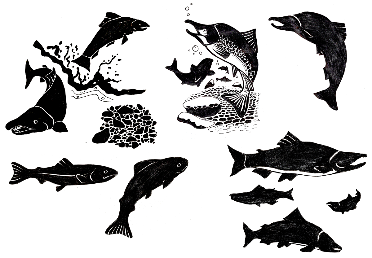
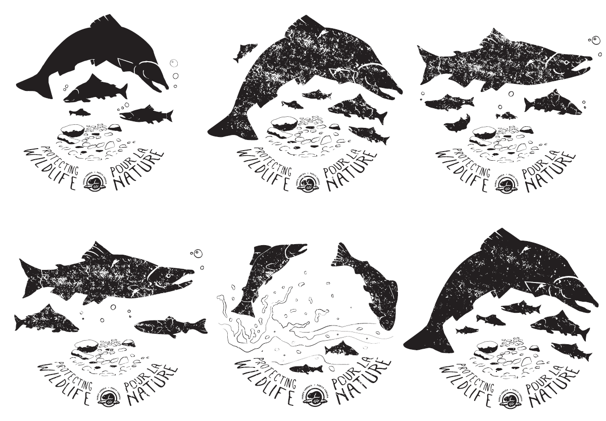
A special edition design for Park's Canada's Species at Risk series needed to be designed for Sockeye Salmon.
I illustrated salmon in variations of details and angles, noting that the final piece would be one-colour printed in various sizes.
Next, I arranged my drawings around the text layout that had been used for the other Species at Risk artworks. Below are the stages of development based on feedback from the client.
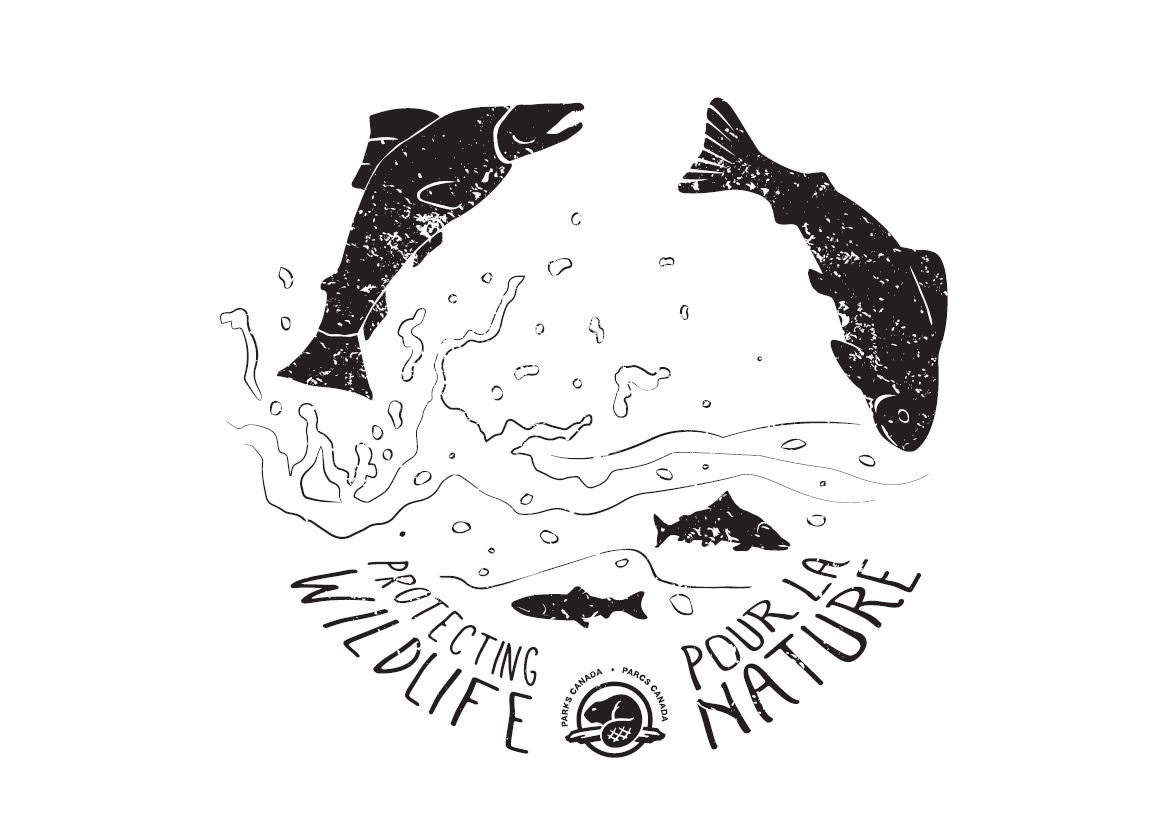
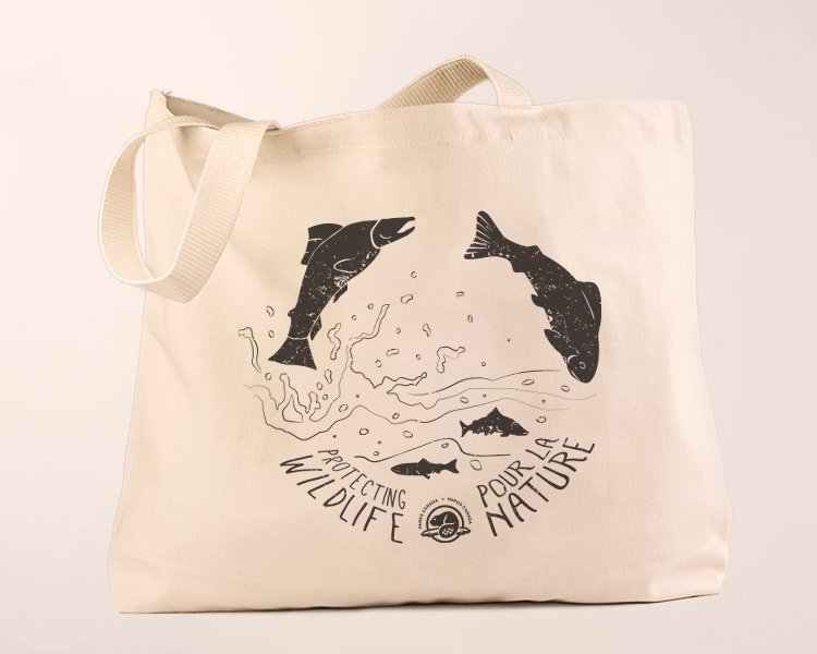
Below is the final approved artwork along with an example of a product offering this design in retail.
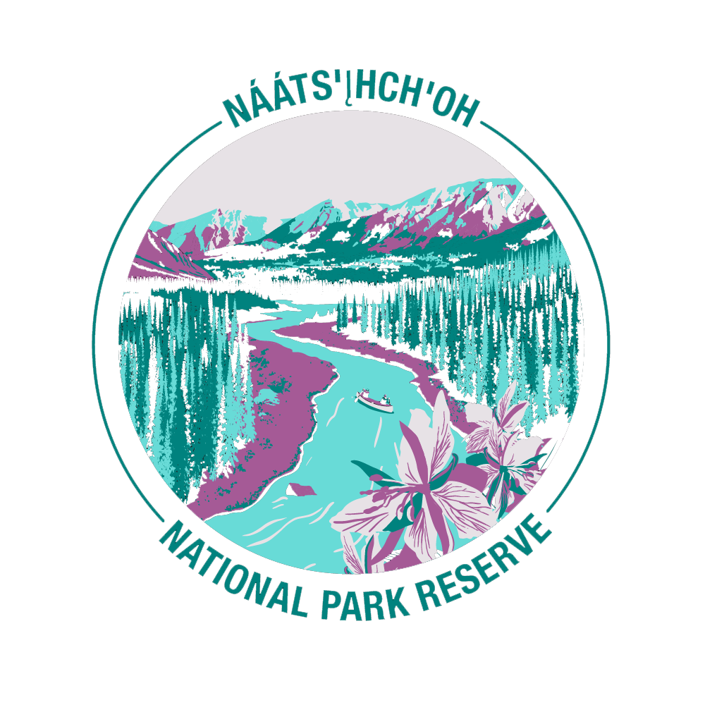
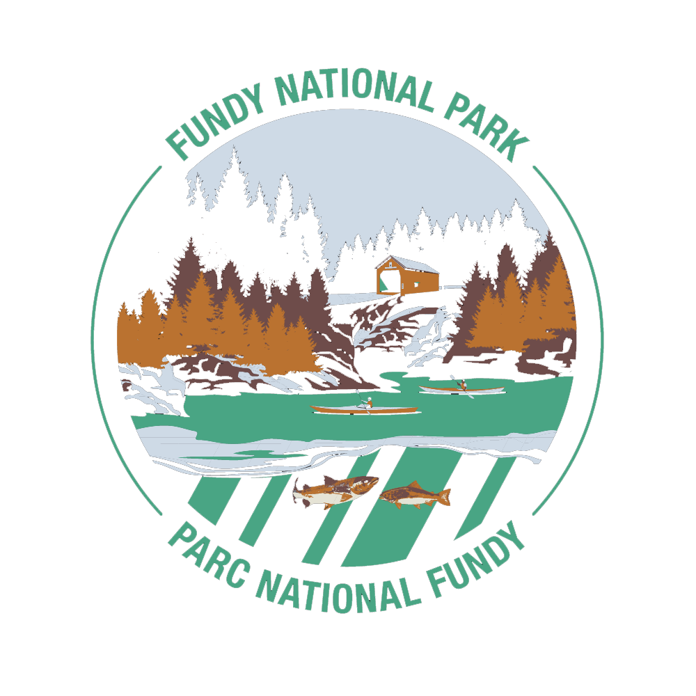
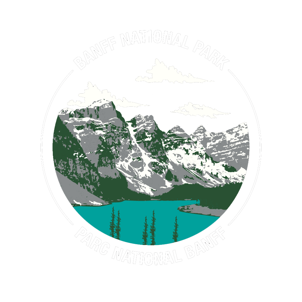
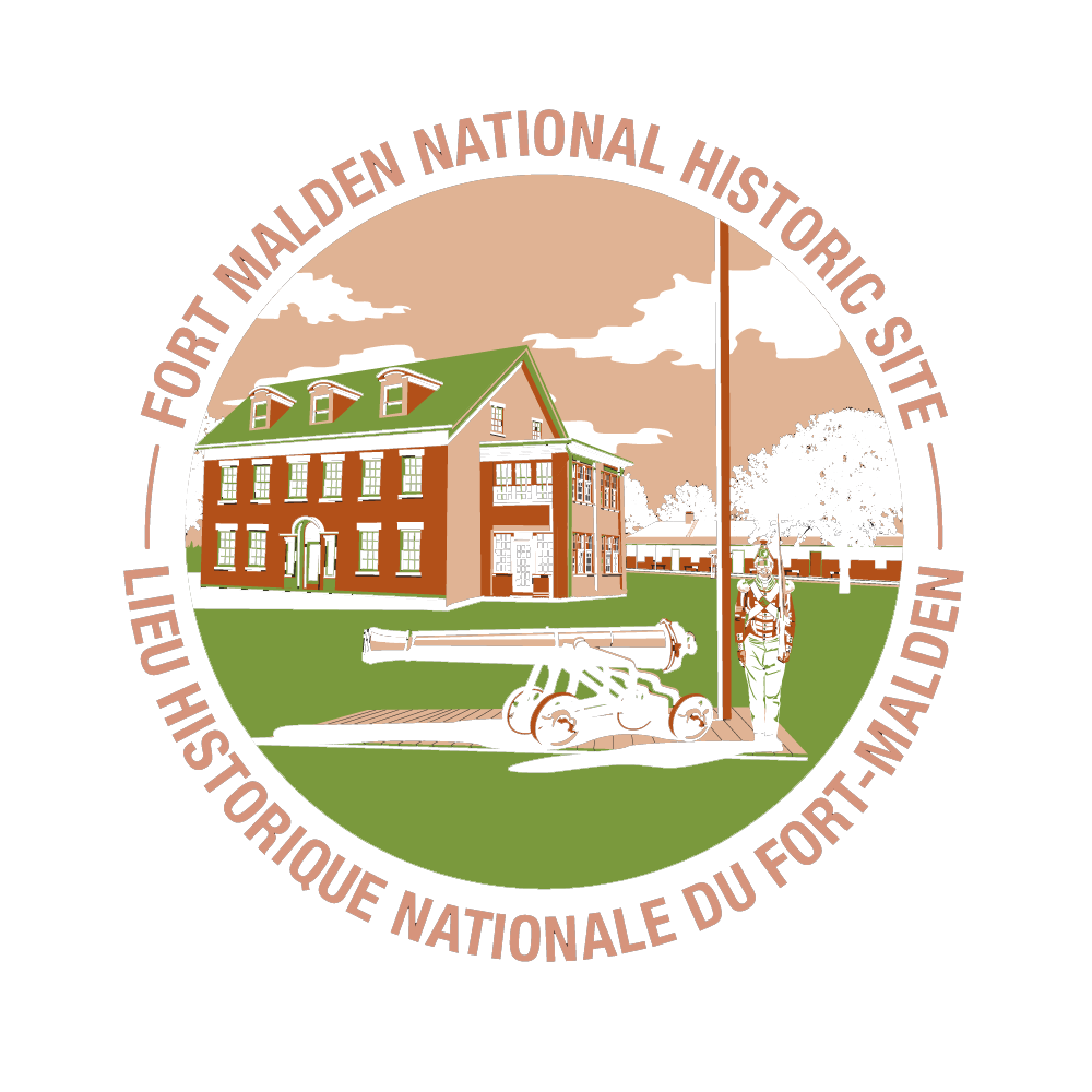
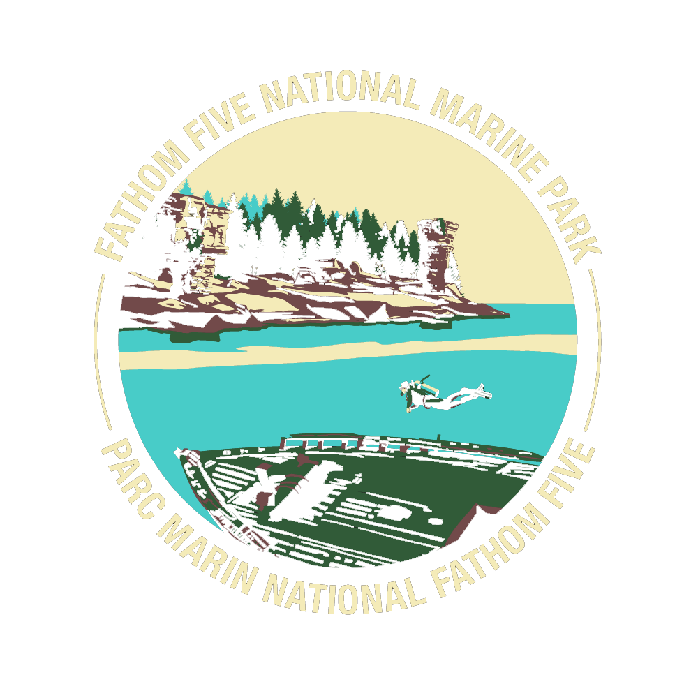
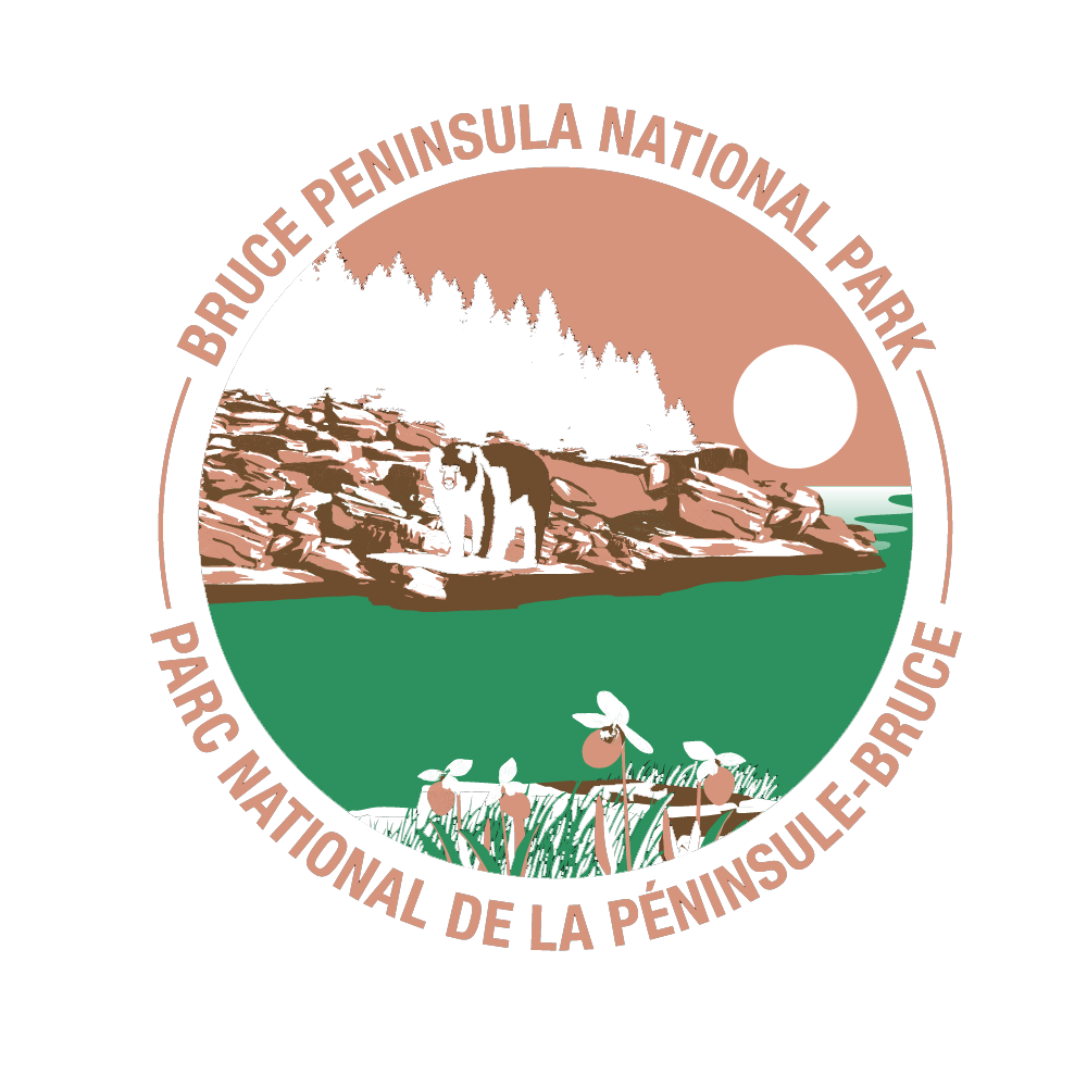
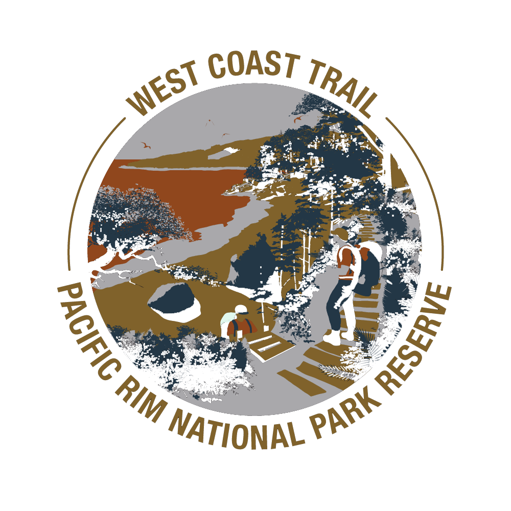
Parks Canada vintage series are a collection of full-colour illustrations that feature scenery and nature from each of Parks Canada's National Parks and Historic Sites. The designs are used to create postcards, pins, patches, wooden signs, calendars, tuber'z and t-shirts.
The t-shirt collection is unique in that they are all simplified to a palette of 4 colours. THe result makes the artwork pop on charcoal heather t-shirts. It was my job to pick the best colours that allowed the artwork to have enough contrast while retaining the overall colour scheme of the original (if the client desired).
The below are what I consider my best out of the number of pieces I repurposed.
Original full-colour artworks are all created by Zhenjia Fan.
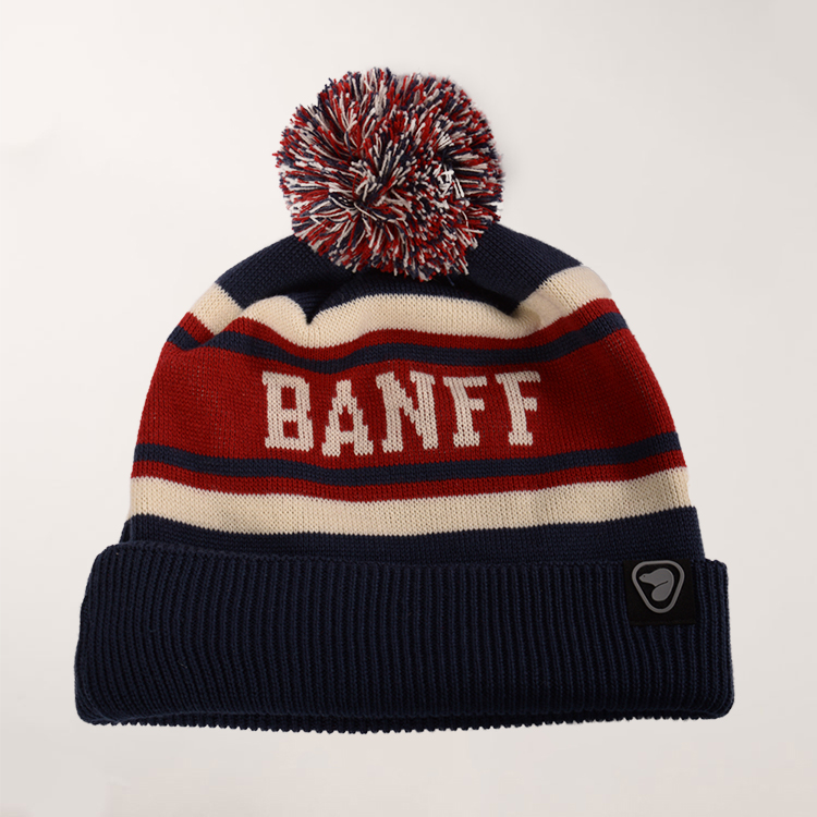
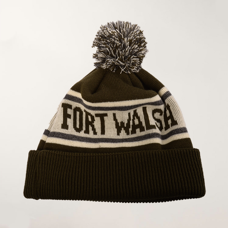
I was asked to design some vintage style toques for Parks Canada. Experimenting with different palettes and typography I came up with many designs for them to choose from.
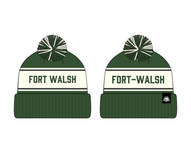
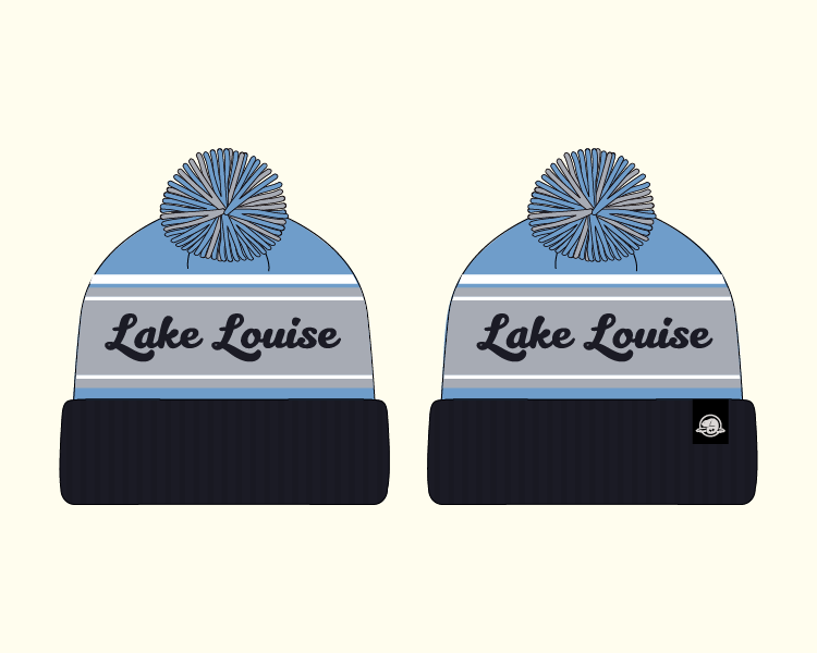
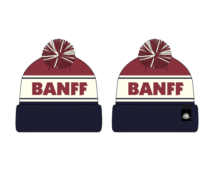
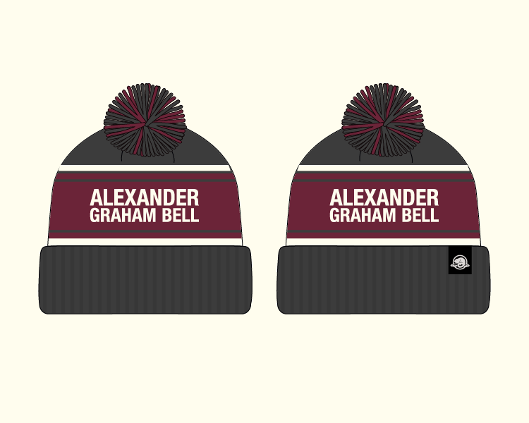
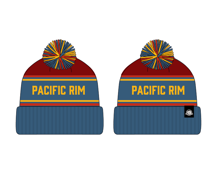
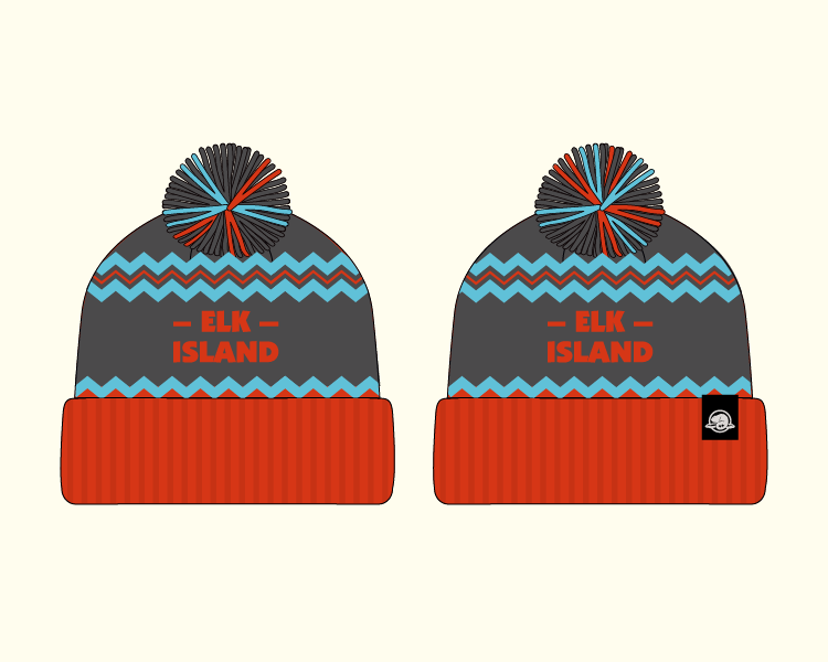
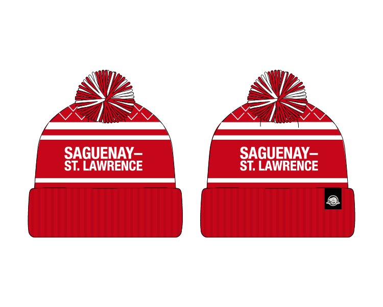
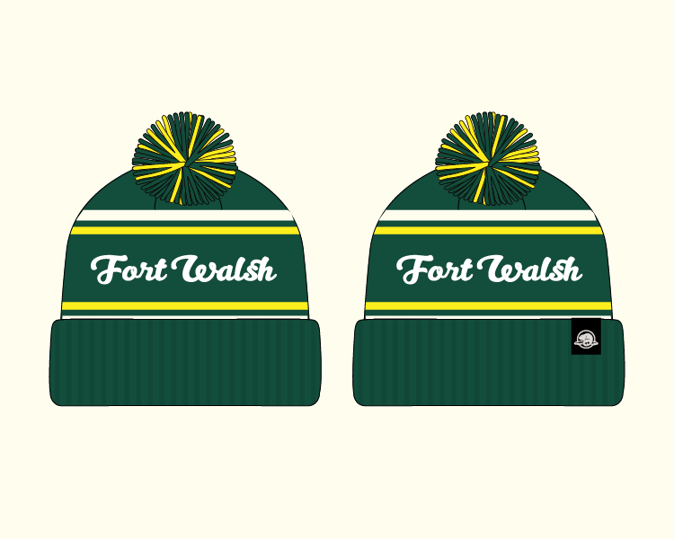
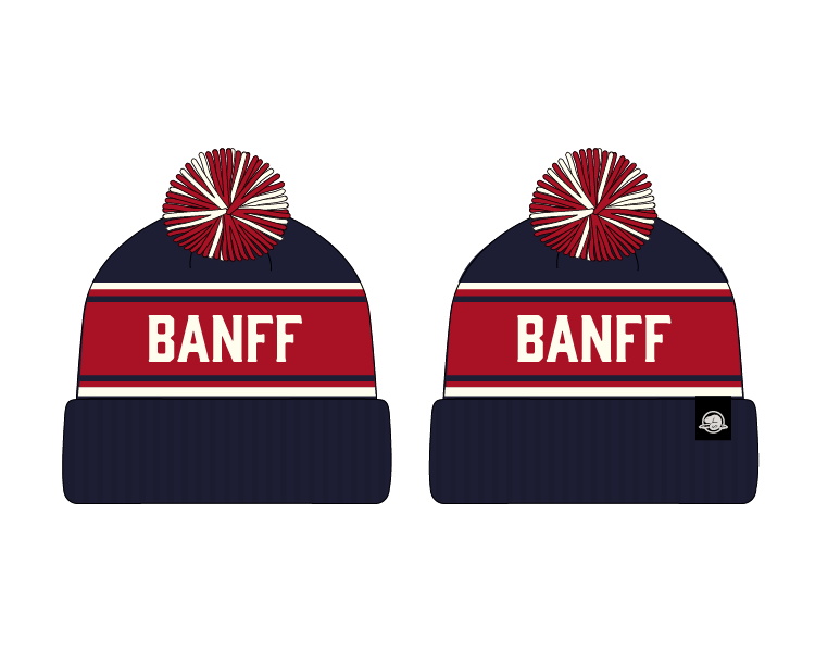
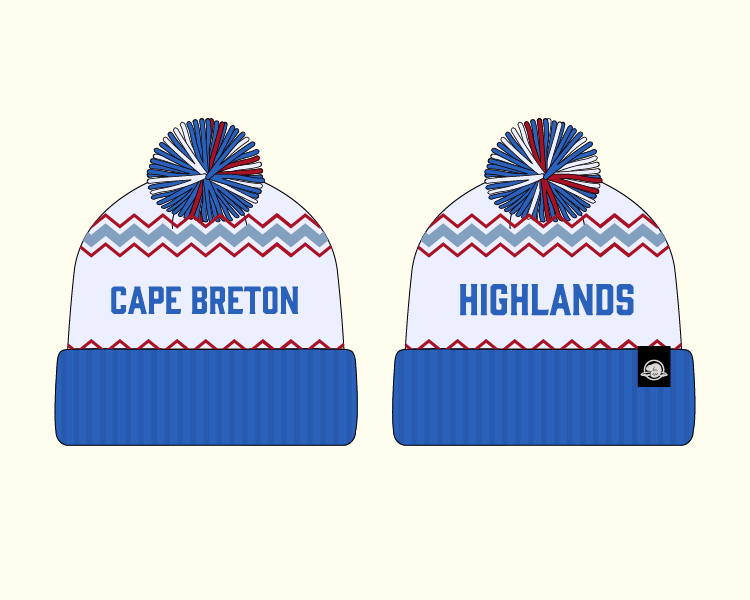
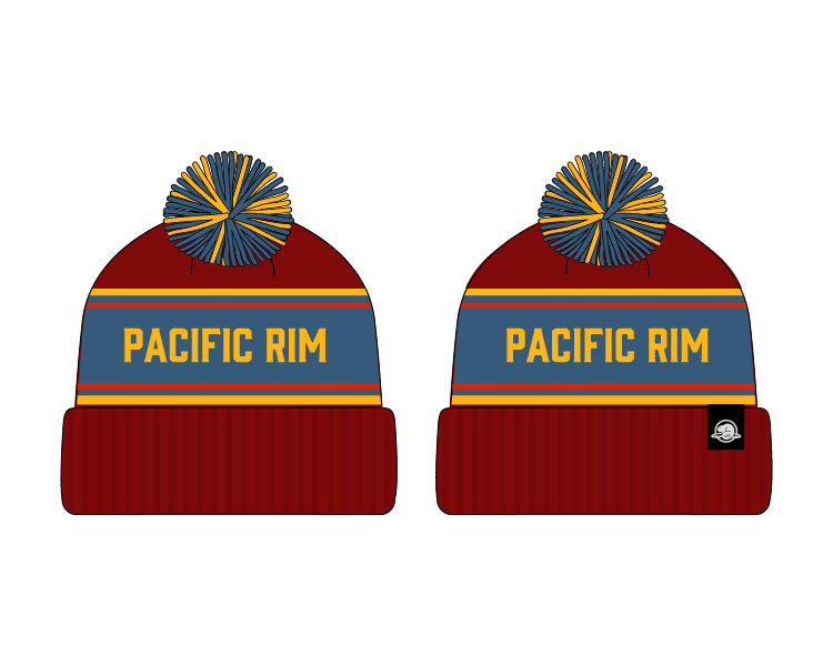
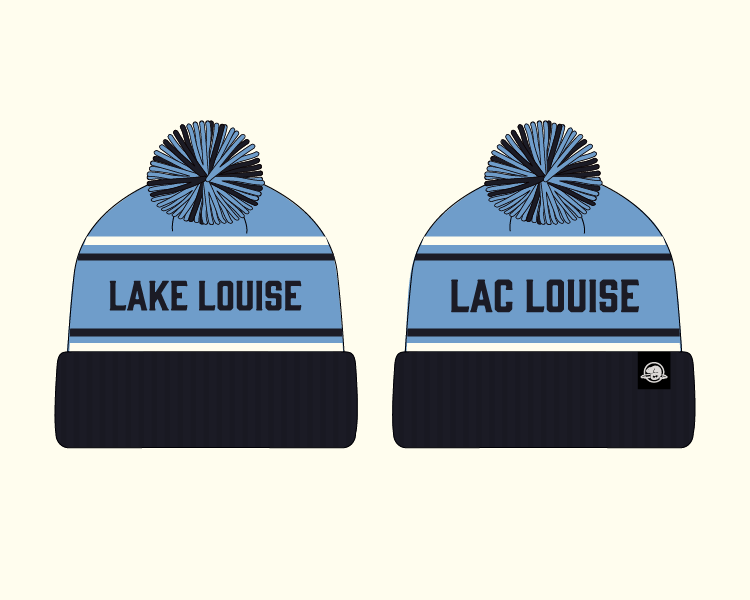
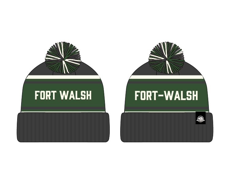
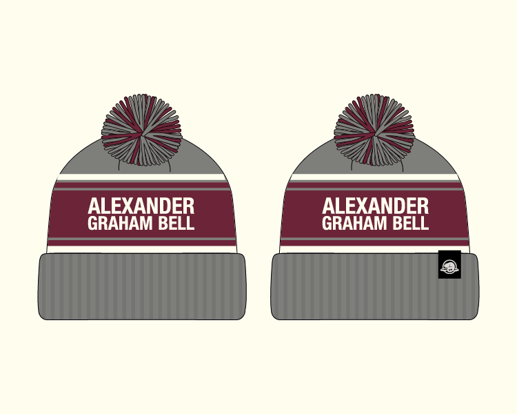
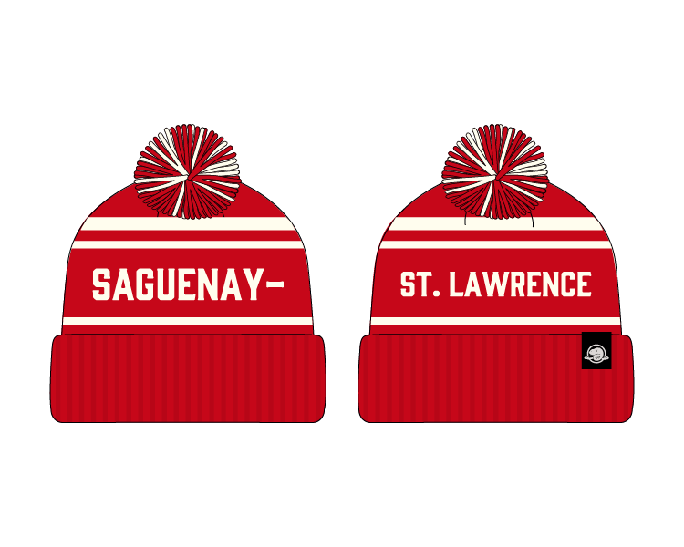
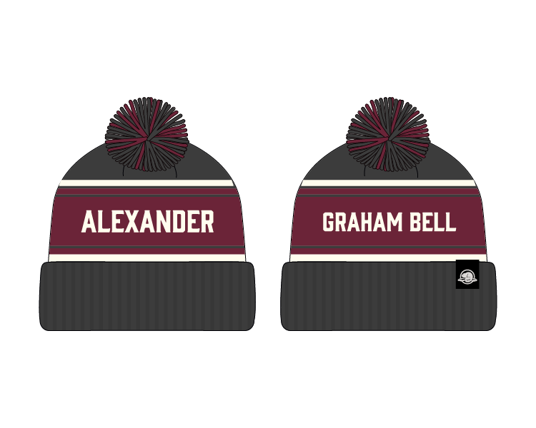
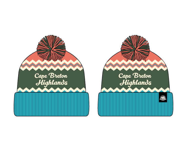
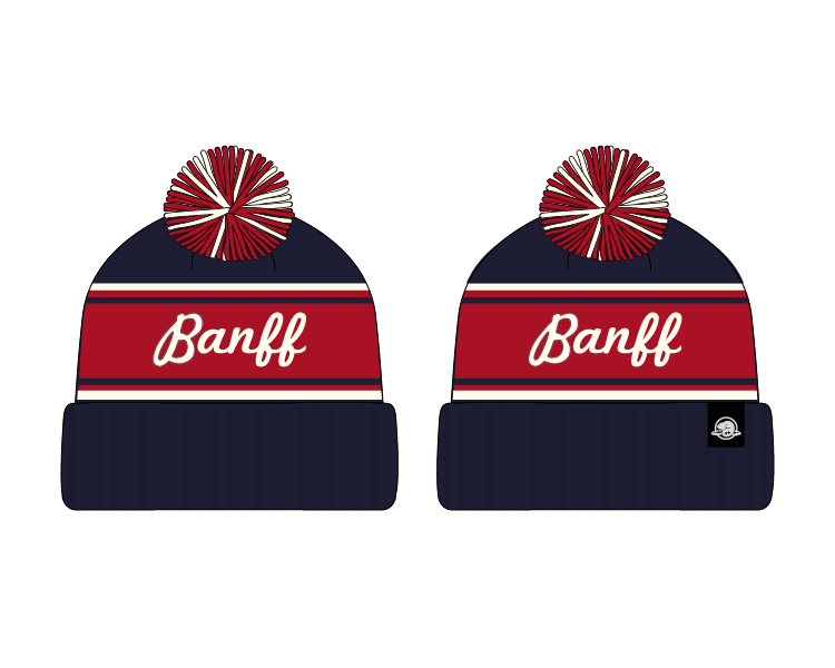
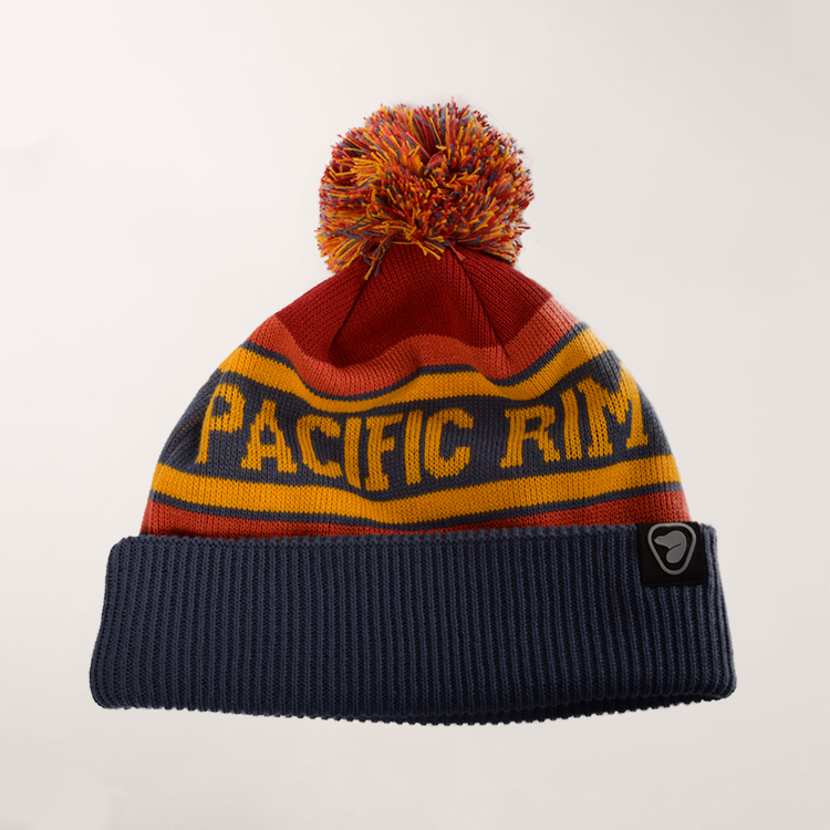
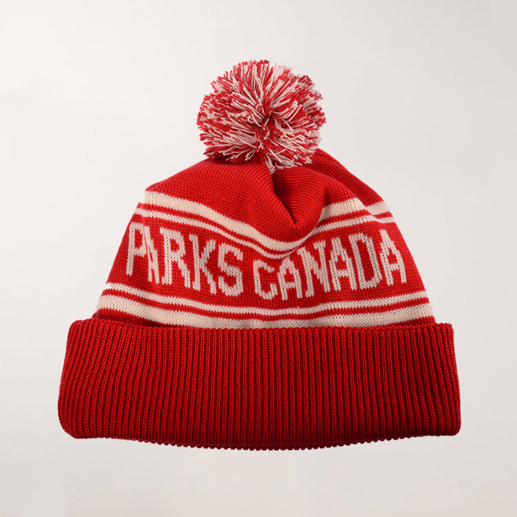
This was a fun project to work on as I had the opportunity to work with typography in Inukititut in addition to English to create some beautiful layouts.
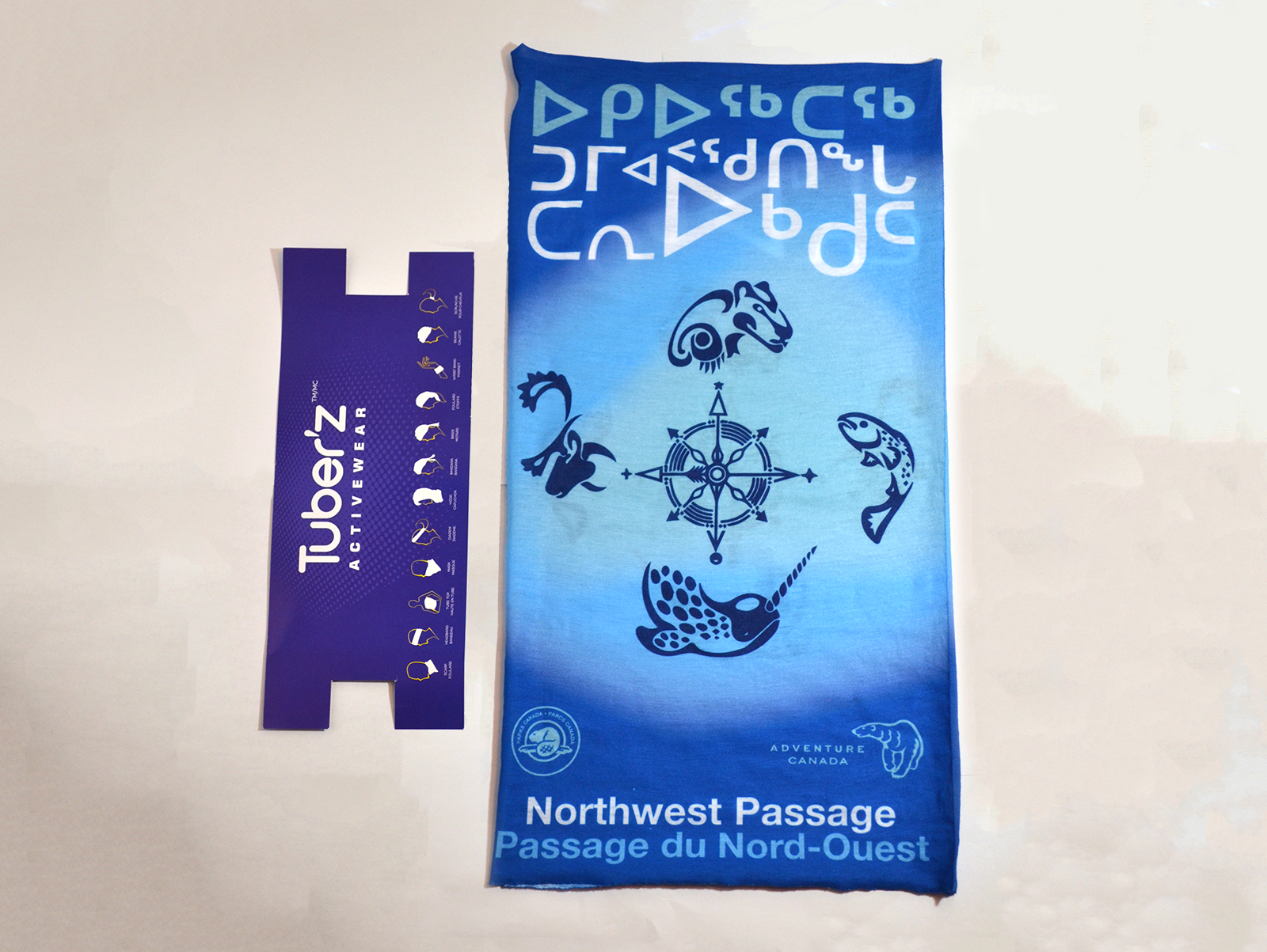
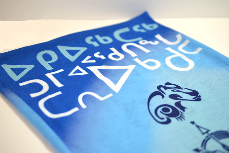
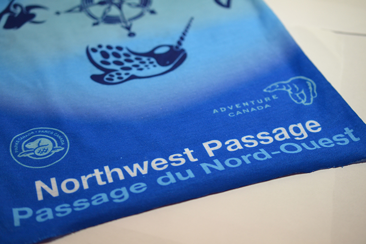
Parks Canada was looking to create a tuber design based from an Inukitiut drawing and the Inukitut native language as well as French translating to 'Northwest Passage'. The design also needed to include the Parks Canada brand colours and 2 logos. Since the tuber imprint was to be in a narrow portrait orientation, sizing the elements within was very crucial.
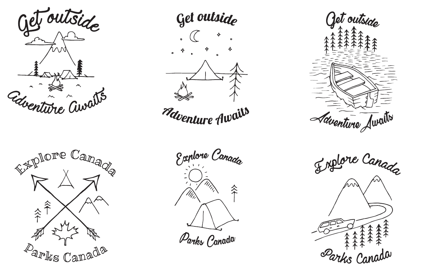
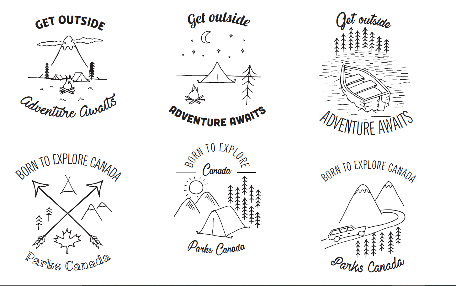
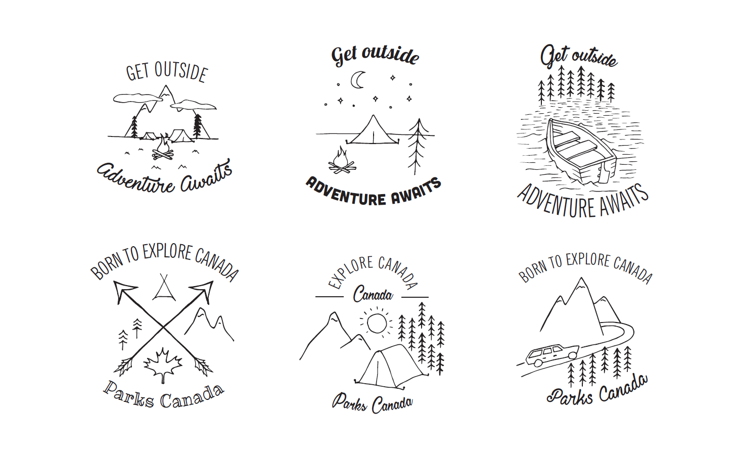
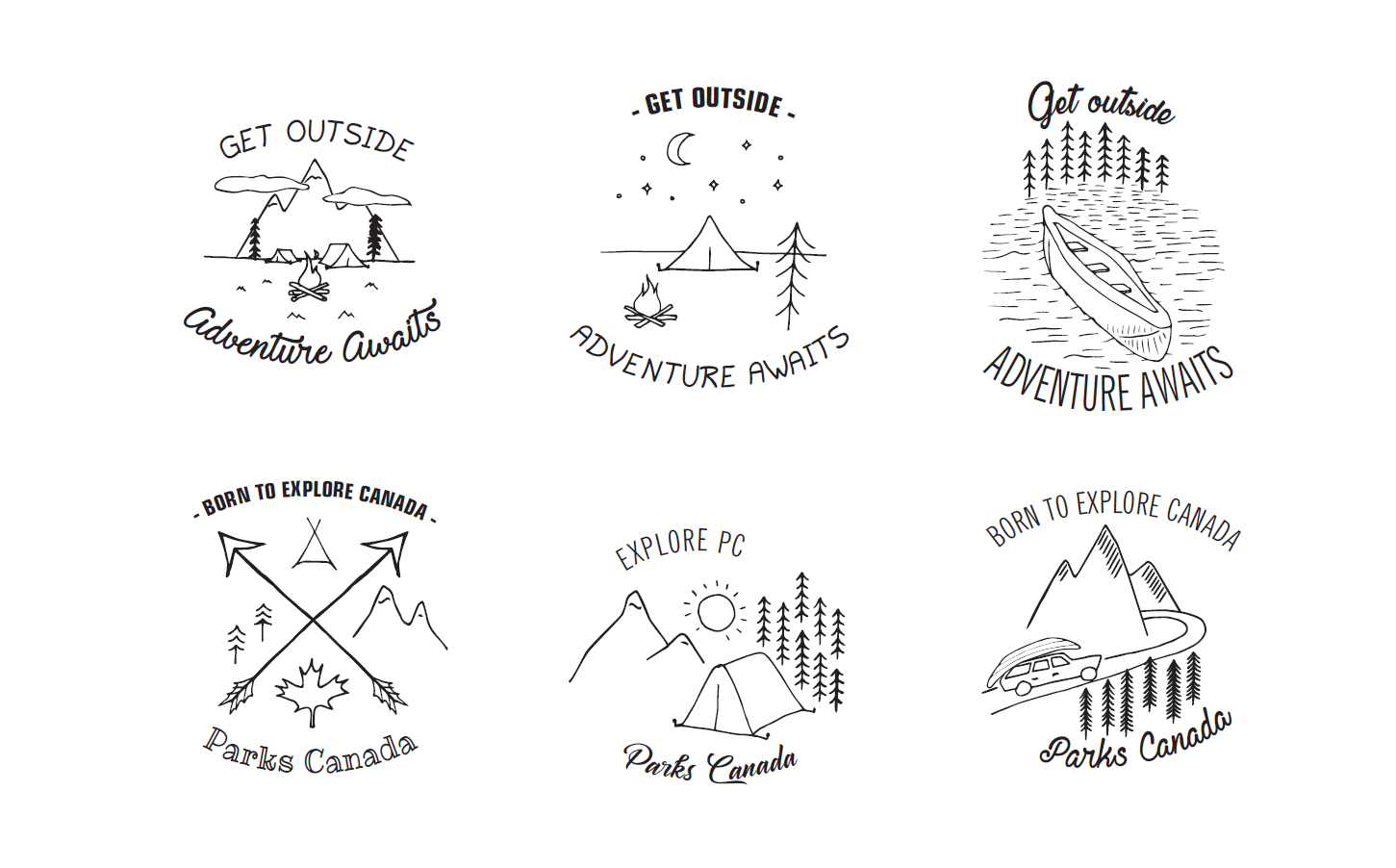
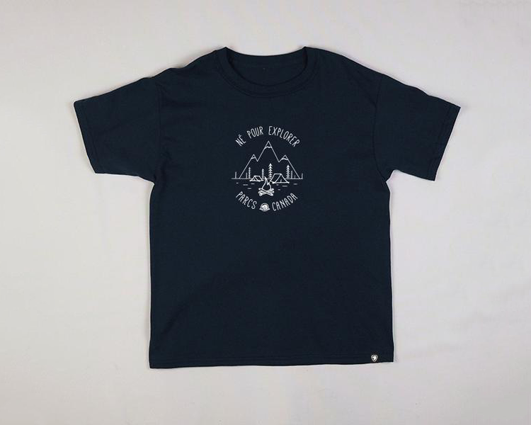
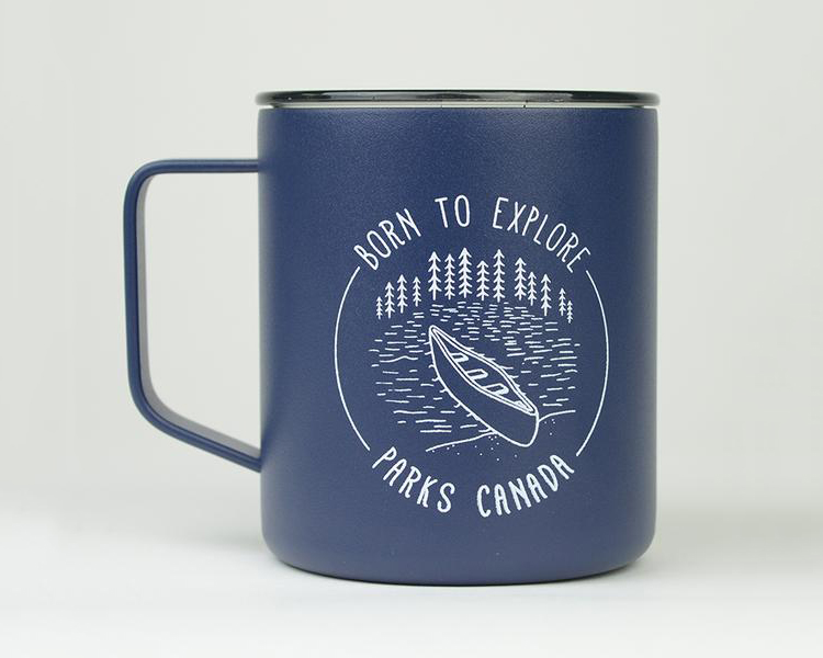
Parks Canada requested some vintage-styled camping drawings for various apparel and drinkware merchandise.
With direction from Parks Canada's brand manager, I came up with six different badge-shaped concepts, then once transfered to Illustrator, combined various fonts to come up with three strong pieces to feature on merchandise.
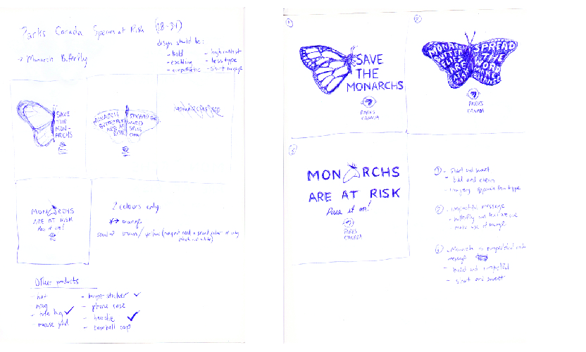
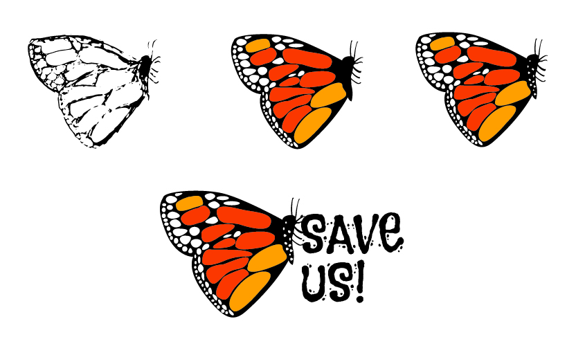
An application process for a Graphic Designer position for which I applied, I was asked by the employer to come up with some campaign work for Parks Canada based on their "Species at Risk" list with a time limit of 4 hours. The employer told me to focus on quality over quantity.
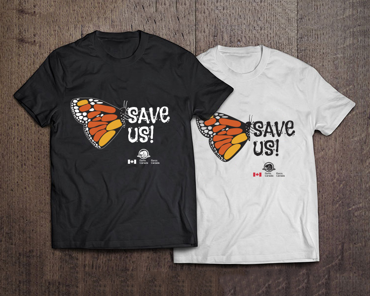
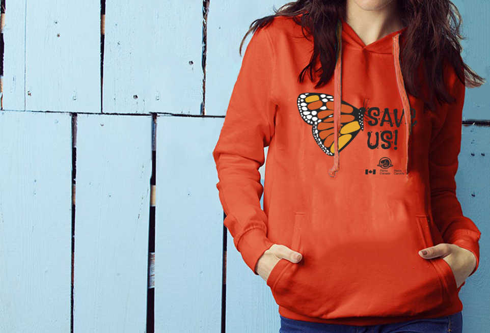
For my design I chose the Monarch Butterfly. After deciding between 3 different directions on my concept, I had to showcase my design on a t-shirt, 2 other products and create an e-blast as a way to advertise the campaign.